The logo of certain well-loved brands may well be as important as the cross of Christ for some. Porsche recently unveiled their newly redesigned logo, which has remained untouched since 2008. Though the design may rankle some die-hard fans, we think that if one is going to fix something that isn’t broken, only fix it up a little — which is exactly what the German automaker did.
Brand loyalty affects the best of us, and oftentimes it’s hard to pinpoint why we like a certain brand so much. For instance, a swift look at Apple fanboys (no hate — I’m an iPhone user myself) and how they justify their wanton lust for the latest Apple product — superior tech, better camera, etc — are revealed to be simply hubris when one compares, say, an iPhone to any of its major market competitors.
So what’s the real reason? An emotional connection prevails in brand loyalty over specs and numbers. We buy and covet certain labels because they reflect who we want to be, and how we want to be perceived. For better or worse, brands are inexorably tied with self-identity in this materialistic little world of ours. And what are the literal faces of the brand? Logos. No wonder some people get big mad when that face changes.

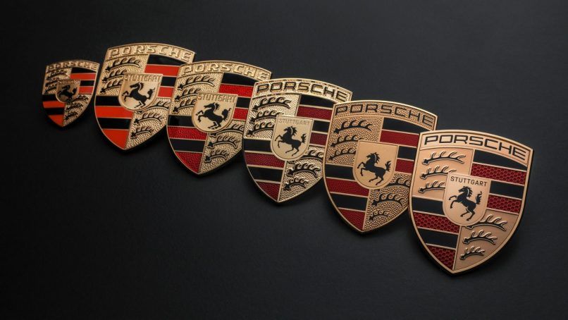
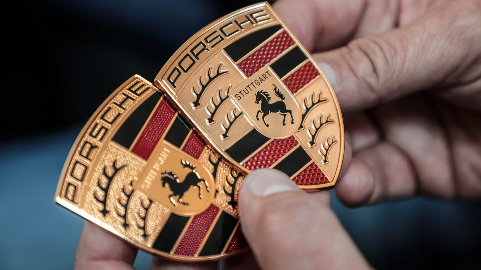
An evolution of Porsche’s signature crest through the years, oldest to newest from left to right. (Image c/o Porsche)Porsche took three years to design the latest version, and though the changes are barely noticeable (the Internet currently offers comparison articles and videos galore), the new logo’s subtlety is exactly why we think it’s a success. Elements such as replacing the gold pebbled surface with a brushed gold texture, added details on the horse and making letters “STUTTGART” above black instead of debossed, are subtle touches that perhaps will not be noticeable on their own. Together, the elements serve to streamline and update the logo, removing old details that now feel fussy and stuffy, without losing the logo’s intrinsic character and recognisability.
How many heritage brands have we witnessed banish their house logos to Helvetica hell? The answer is too many, especially in fashion as evidenced by the industry’s two-footed leap into streetwear over the past decade. Burberry may come to its senses yet, as one of the first moves from their current creative director Daniel Lee was de-helveticise the previous logo. The semi-serif font that now serves as the heritage brand’s current logo might be interpreted by optimists as the first of many small steps to break free from the iron grip that blocky helvetica and helvetica-adjacent designs have had on most of our beloved brands in recent years.
But we digress. The airy subtlety of Porsche’s latest crest is a masterclass to heritage brands in all industries on current-day presence without losing what makes something special in the first place. Was three years too long to come up with a logo that feels same same, but different? Our answer is no. Good things take time.


